

Designed with purpose. Built for results.
My Featured Projects
Every business has different goals, audiences and brand voices. That's why every website I create is completely custom, unique, SIGNATURE... and crafted to reflect the brand, UX(user experience) and ready to grow with the business. Lets check out some of my projects to see how all of these factors come together for each business:
Let's explore my world of digital design
You can explore by category or just scroll...


CHECK OUT THE DETAILS!

New Beginnings Real Estate was designed to do more than simply showcase available properties... it was built to establish trust, simplify the rental experience, and position the company as a professional, dependable resource for property owners and tenants. Every page was intentionally structured to make important information easy to find while guiding visitors toward the next step, whether they’re searching for a home, submitting an application, or accessing their client portal. Strategic layouts, clear navigation, and a polished visual identity work together to create a seamless experience..
➡️Check out their full transformation story here, with before & afters!
KEY HIGHLIGHTS:
-
SEO-friendly page structure & content organization
-
Custom layout & design; no templates or AI
-
Strategic & simple UX(user experience)
-
Mobile optimized design
-
Property listings powered by CMS
-
Rental application & client portal access
-
Movement with transitions & subtle animations


CHECK OUT THE DETAILS!

Glow Lab Aesthetics & Wellness was designed to do more than just showcase treatments... it was built to establish trust, elevate perceived value and position this practice as a leader in modern aesthetics. Every page was structured to guide visitors through a seamless journey; balancing education with strategic CTA's to build confidence for the viewer. Every detail works together to reinforce credibility and create a luxury experience for the viewer even before they book. The result is a website that not only attracts but strengthens the brands authority.
KEY HIGHLIGHTS:
-
SEO friendly page structure & content organization
-
Custom layout & designs (no templates or AI)
-
Strategic navigation
-
Mobile-optimized
-
Luxury branding
-
Movement with transitions, animations & video


CHECK OUT THE DETAILS!

Uptime Mobile Services was designed to communicate reliability from the very first interaction. The website was strategically built to create authority and make the viewer feel confident that their needs will be resolved with ease. This clean and modern design reflects the professional and creditable branding that this business represents. From the simple navigation to the flow of the homepage... every detail was created to present a seamless and simple experience even before the viewer books; giving the future client a confident journey from the start.
KEY HIGHLIGHTS:
-
SEO friendly page structure & content organization
-
Custom layout & designs (no templates or AI)
-
Mobile first experience for their ideal client
-
Trust-building designs and aesthetics
-
Movement with transitions, animations & video


CHECK OUT THE DETAILS!
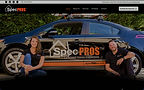
SpecPROS required a website that reflected the same precision, professionalism and attention to detail that their clients expect during a home inspection; reinforcing the owners authority in this industry. Every detail of this website was designed to build confidence and trust before they even schedule their inspection... because buying a home is a huge investment and you want to make sure it's the right one. This layout is built to be one flow with jumping anchors to each section as needed. This website positions SpecPROS as a trusted leader in the industry and creates a polished user experience from the beginning.
KEY HIGHLIGHTS:
-
SEO friendly page structure & content organization
-
Custom layout & designs (no templates or AI)
-
Mobile friendly design
-
Trust-building aesthetics
-
Movement with transitions, animations & video
-
Seamless integration of their third-party booking system
RENOUVEAU WELLNESS & BEAUTY

CHECK OUT THE DETAILS!

Renouveau was designed to create a digital experience that feels luxury but welcoming to all. Rather than plainly listing out their services, I designed this website to immerse visitors in the Renouveau branded experience while guiding them naturally toward the services and information. This brand aims for a luxury experience and I created this site to reflect just that; from beginning to end. The result is a website that does more than look beautify... it communicates the quality of the experience before they ever even book. Presenting this brands authority in their field and presenting TRUST.
KEY HIGHLIGHTS:
-
SEO friendly page structure & content organization
-
Custom layout & designs (no templates or AI)
-
Mobile friendly design
-
Strategic flow & CTA's
-
Movement with transitions and animations
-
Psychology backed design and structure


CHECK OUT THE DETAILS!

Forever Enchanted Occasions was designed to be a one-of-a-kind experience to feel like an invitation into another world... because when your business creates extraordinary experiences for their customers, your website needs to SELL that experience from the start. Each event has its own page and each of those event pages are designed completely different; with immersive visuals and designs. This website steps outside the box of a "traditional" website layout to really present the unique and thoughtful events they host. This business HAD to have a website that is carefully structured to bring the visitor on a journey and build anticipation before the upcoming events. The details on this website is far beyond "average" or "template".
KEY HIGHLIGHTS:
-
SEO friendly page structure & content organization
-
Immersive custom layout & designs (no templates or AI)
-
Mobile friendly design
-
Non-traditional layout flow
-
Movement with transitions, animations & video


CHECK OUT THE DETAILS!

Julian Fire & Rescue needed a digital presence that felt as dependable and professional as the people behind it. This website was intentionally designed to make important info easy to find and to help create a strong bond with the community it serves. Clear navigation, community blog posts, organized resources and external links and strategically designs layout structure. This business obviously needs a different approach to their website than a business that sells products or services; this means the approach to this digital presence was to prioritize the community rather than "customers".
KEY HIGHLIGHTS:
-
Community-first design approach
-
Custom layout & designs (no templates or AI)
-
Mobile first experience
-
Trust-building designs and aesthetics
-
Informative contant and flow


CHECK OUT THE DETAILS!

Franklinville Diner needed a digital presence that felt just as warm, welcoming, and community-driven as the diner itself. With deep roots in Franklinville and a reputation for home-cooked meals and bringing people together, the website was designed to feel less like a traditional restaurant website and more like an extension of the diner’s personality.
From the menu and hours to location, upcoming events, and a glimpse into what’s happening at the diner. A strong visual presence, easy navigation, and community-focused content help create a website that feels familiar and true to the Franklinville Diner experience.
KEY HIGHLIGHTS:
-
Community-focused website experience
-
Custom layout & design. No templates or AI
-
Warm, welcoming visuals
-
Easy and simple navigation menu
-
Mobile-first experience
-
Events, announcements & community content
-
Designed to reflect the personality of the diner